A website is more than just an expensive yellow pages ad.
A website is more than just an expensive yellow pages ad.
If you want it to be, that is. When we’re talking about nonprofit web design best practices, it’s A LOT more.
A basic nonprofit website can do a lot for you, but putting a little more effort into the production and management of your site can make a huge difference.
By following all or even just a few of the nonprofit web design best practices listed here, your site will start to perform and function better. These simple principles, suggestions, and guidelines are meant to help you in your quest for taking your clunky old site from the early 2000’s or older…. and bringing it to the web of 2020.
1. Consistent Branding Makes A Huge Difference
Having your brand extend into your site allows for your site to become just that, an extension of your brand.
Branding allows your audience to feel like they are in the right place: that your product, service, and information are more valid because they match what your site visitor perceives your brand to be. A website that is dissonant, or in contrast to the parent brand, creates a disconnect between the brand overall, and the user experience your visitor is expecting.
2. White Space Is Your Friend
Do not fear the white space on your website! It is good to let content “breathe.” Having a little white space – even a lot of white space if your brand allows – can give your content a better sense of flow.
White space does not need to be white: it is the extra space given to content in relationship to other content. Giving that extra space between chunks of content lends your user a better sense of connection to the content and makes your site feel more designed and less thrown together.
3. Color Blocking and Color Contrast, Using Positive & Negative Space Effectively
We talked about white space earlier as a nonprofit web design best practice. Too much white space looks boring – unless done well – and it’s difficult to do a lot of white space well.
Consider using this in an interesting way that lends itself well to your brand and organizing principles of your site — it can make a huge impact on how visitors use your site.
One way that you can use a lot of white space (literally) is to use color blocking. You can give plenty of breathing room to content by breaking it up with color blocking.
4. Using Human Faces
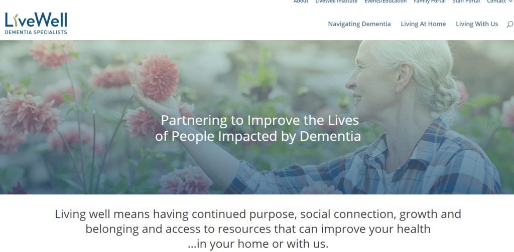
We are humans and relate to one another; incorporating human faces in some way on your site is a huge help to making your site feel relatable and like one with which people can connect.
That being said, the human faces you choose don’t have to be photos. Be unique and find interesting ways to utilize faces to get people to connect with your content. You can try illustrations or animations.
Human faces are great and perhaps work the best, but faces in general are emotive and can be those of characters used in your brand, or other anthropomorphic creatures. Use your imagination and your brand to come up with something that works for you and your site.
Faces are what’s important, whether human or created.
5. Familiarity Is A Good Thing: Use It To Your Advantage
Look, we all want to be different, unique and stand away from the crowd. Instead, use the tools, resources, and knowledge available to create an impactful and great experience for your users. You do not need to recreate the wheel and in fact, studies show that utilizing similar and familiar ways of organizing, presenting, and structuring your site gives your user a more frictionless experience.
This lack of friction means you are able to do more of what you do best for your users. It is good to be familiar; it is bad to be exactly the same. Imitate, do not copy verbatim. Use pieces and parts, but do not copy the whole.
6. Build With The Path Of Least Resistance In Mind
As we’ve been discussing, simplicity is a good thing. Utilize a simple navigation plan. Don’t make it difficult for your user to move from one page to another. Avoid making your site navigation into a maze. Instead, make it a house with rooms and items in the rooms that people interact with, but then move on to another room.
Keeping your navigation simple allows your user to move freely through the site, not get stuck or lost, and to have a good experience. Ultimately, this means your content is more likely to be found.

7. Sliders and Carousels
From my perspective, when it comes to sliders and carousels on your website, you would do best to not use them…
A single slide?
Sure that can work. Its more of a banner in this sense, but not a full slider or carousel.
Why?
Because people don’t want to wait to see information slide in front of them. Sliders and carousels used to be great and were used a lot in site design. Over time their overuse led to a retreat to simpler layouts that don’t require the user to wait around to find what they need. As a web design best practice, leave them out.
Also of note, carousels and sliders typically bog down the page load speed which can impact your site’s search rankings and your traffic levels.
Best Practices: Bottom Line
In summary, just keep these 7 best practices for nonprofit web design in mind and they will help you build and maintain your site now, and into the future. The internet has come a long way and there is a lot that your website can do for your nonprofit. The best piece of advice we can give is to not let your site be just “good enough,” or let it languish in the doldrums of forgotten updates and content management.
Looking for more? There is a lot that you can do! Contact us and your nonprofit can benefit from our experience. As a nonprofit, your site needs to reflect not only your brand and your mission, but also needs to motivate your supporters to take action – to support you through donating, volunteering, or advocating.
iMission has built many successful websites for CT nonprofits. If you’d like to learn more about how we can help with your website design project, contact us: info@imissioninstitute.org , or call 203-747-8042 ext 700.
About the Author: Brian Monahan is iMission Institute’s Director of Web Strategy And Development. Brian’s breadth of experience in designing nonprofit websites has led iMission to be recognized among Connecticut’s leading design consultants. Contact Brian directly at 203-747-8042.
Want more great articles like this? Sign up for our free monthly newsletter!


